|
|
 |
|
These three servants are painted with colours that tie them to each other, yet each one stands out with the colours of
blue, parchment, and marble.
|
|
|
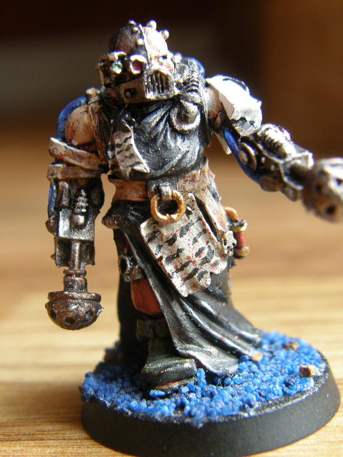
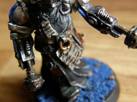
This model is tied to the other two with black, white and parchment, but stands out with the blues in the tubes
connecting his arms. The blue in his eyes and on the gravel also bring out this colour, creating a hyper-realized paint scheme.
|
|
|
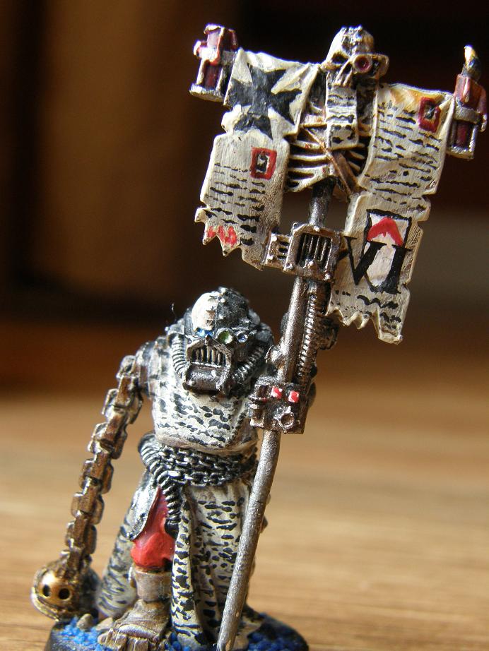
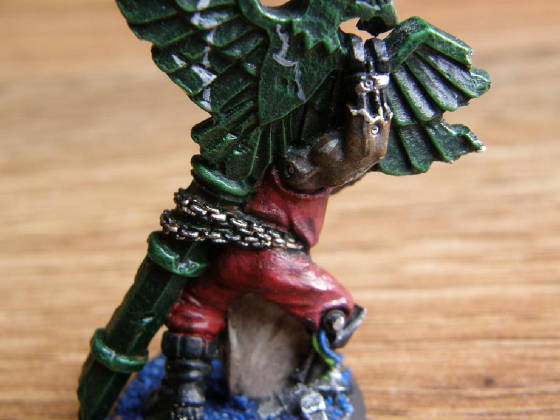
Another shot of the same model, some of the smaller details can be seen, such as the small blood spatters on the script,
as well as a hint of emotion within the characters face.
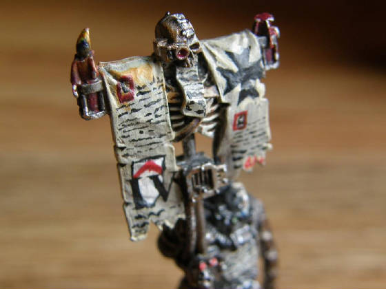
I am very happy overall with how this banner turned out. I really think that the writing and symbols were well
represented and detailed, and that it was unique enough to catch the eye of the observer. One thing that this has reminded
me of however, is representing candlelight. It is a challenge, but one I am rising up to slowly.
|
|
|
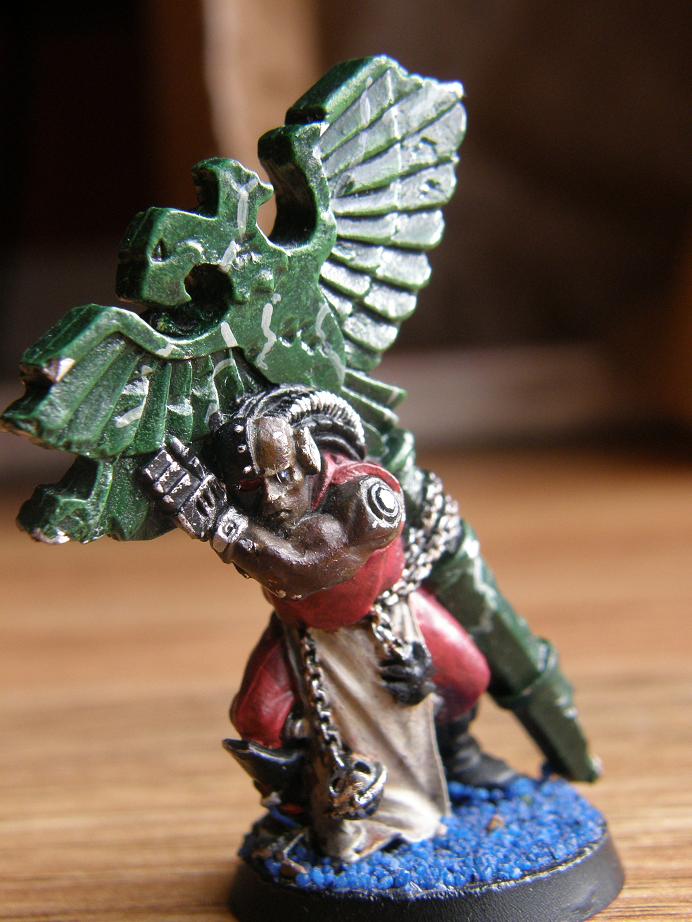
On this model, I believe that the metallics and cloths were well represented. Again, I attempted to convey emotion
through subtle brush strokes around the models eye. The beige ties the model in with the others, yet the red is present
as well, standing out against the green pillar.
I enjoyed learning how to create a marbled look. The coloumn turned out almost how I wanted it to, however, the
grey lines were thicker than I had hoped for, resulting in an unprofessional finish. This piece helped me to figure
out what I needed to do to make my brush strokes even thinner, and helped to contribute to several models painted after it.
|
|
|
|
|
|
|
|
|